Paper Before Pavilions: The Posters That Announce a Chilterns Festival
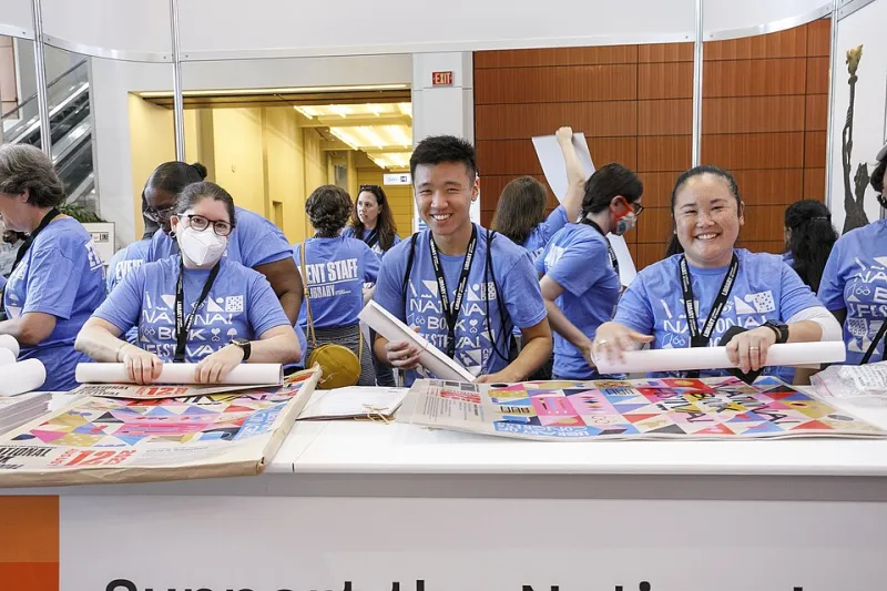
Photo: Library of Congress Life, CC0, via Wikimedia Commons
A festival does not begin when the tent goes up. It begins with a sheet of paper.
You see it first on a Tuesday, on the way to the station, on a board outside a deli that still has a hand-written note about soup. A rectangle of colour, slightly too big for the space allowed, a name in a font you can't quite place, a date. Then a week later there are four of them, and one is in the bookshop window, and one has migrated to the noticeboard by the church, and one — inevitably — is behind the glass of a hairdresser's with a handwritten card beneath it saying ask inside for tickets.
By the time anyone wheels a trolley of chairs across a village hall floor, the festival has been in town for a month. It has been doing its work in silence, in the rain, on the side of a lamppost, for free.
A second and a half, from a car window
The people who make these things tend to be modest about them, so it's worth saying plainly: a festival poster has one of the hardest jobs in local design. It has to be legible from a moving vehicle, from across a high street, from three feet away in a crowded window, and from a phone screen after someone has photographed it badly and put it on a community page.
"You've got about a second and a half," says a designer who has worked on three Chilterns programmes and now refuses to look at her own artwork in public. "That's it. If the name isn't readable in that time, nothing else matters. Not the illustration, not the lovely paper stock, not any of it."
The best of them solve this with brutal simplicity. One strong word. A colour that doesn't appear anywhere else on the high street. A date that reads as a date. Watching a designer argue with a committee about whether the website can be moved from the bottom right to the bottom left is one of the great spectator sports of the festival calendar.
The problem of looking like everyone else
Here's the difficulty with a literary festival in a market town: it wants to look like a literary festival, and every other literary festival wants the same thing. Which means serif typefaces, a muted palette, and — reliably — a book. Sometimes an open book. Sometimes a stack. Occasionally a single volume seen from an angle that requires real commitment.
The designers who get past this tend to reach for something local instead. A rooftop. A ridgeline. A strange bit of brickwork behind the library. One memorable campaign ditched books altogether and put the town's war memorial on the front, which caused a fortnight of lively correspondence and, by all accounts, an excellent turnout.
"If you put a book on it, you've said 'books'," one printer told me, cheerfully, while stacking a run of A3s. "If you put a chair on it, you've said 'sit down and listen to someone for an hour'. I know which one I'd rather hang in my kitchen."
What actually survives a wet October
There is a whole physics to this that nobody outside the trade thinks about, and the printer is the person who knows it.
A poster that goes up in late September and is still doing its job in November has survived at least two proper soakings, a spell of sideways drizzle, and the attentions of whoever is in charge of the town's lamp posts. Paper weight matters. So does ink. Risograph prints are gorgeous and cheap and fade in a sunny window with a speed that would break your heart. Lamination on a window card will get you through the winter. Staple placement, apparently, is a whole discipline.
Then there's the quiet hierarchy of where a poster ends up. The board outside the Co-op. The glass by the till in the bookshop, which is prime real estate and fought over. The pub door, which reaches an entirely different and much more nocturnal audience. The inside of a bus shelter, which reaches everyone and is, according to one long-suffering organiser, "the only advertising we've ever done that actually worked".
The town starts reading itself
Something happens to a high street when a festival's paper trail is good. It stops being a series of shops and becomes, briefly, a programme. You walk from the bakery to the charity shop and you've read four events without trying. You overhear someone in the queue at the pharmacy discussing whether the Tuesday talk is worth it.
The venue owners notice. Ask a café that has hosted a festival breakfast for years and they'll tell you the poster in the window does more work than any social media post they've ever paid for, because it catches people who weren't looking for anything.
"We put it up and people ask about it," one told me. "That's it. That's the whole marketing strategy. Someone stands at the counter waiting for a flat white and reads it because there's nothing else to look at."
Why some of them end up on the wall
Here is the thing I keep coming back to. A few of these posters never make it to the recycling. They get taken home, and a year later they're above somebody's desk, or in a frame in a hallway, or Blu-Tacked to the side of a bookshelf.
It's rarely the busiest design. It's the one with restraint: two colours, one good line, a date small enough to look confident. The sort of thing that reads as a piece of graphic design rather than an announcement. Local print runs mean local artists get to try things — a screen print of 200, a letterpress card, a hand-drawn map of the town with all the venues on it. Those are the ones that become objects.
And there's something quietly lovely about a festival being remembered not by a headliner but by a piece of paper that was pinned to a gate in the rain for six weeks. Most of them, let's be honest, go in the bin. The good ones go on the wall. That's not a bad hit rate for a flyer.
What to look for, this winter
Over the next few months, as the 2027 programmes get drawn up and the print quotes go out, keep an eye on the noticeboards. You'll see the first proof of a festival's personality long before you see a line-up — the colour it chose, the word it led with, whether it put a book on the front or had the nerve to leave it off.
If you see a good one, take it down gently when the festival's over. Somebody spent a fortnight's evenings on it. It deserves better than the recycling.